Welcome to the revised corporate identity guidelines for Durban University of Technology. This identity has been developed by staff and students of Workspace - Work Integrated Learning Design Studio in response to a strategic repositioning plan developed in 2011 and approved by Council in March 2012.
This identity is intended to provide a new platform on which we as TEAM DUT can collectively reposition how we present ourselves to our respective target markets.
This logo and visual identity has been designed to work in tandem with a modular design system, based on the square, with the idea of presenting a unified and single-minded visual voice across a wide range of uses and formats whilst retaining impact.
It is safe to add that no identity is ever complete and that we understand that brand building is an ongoing exercise, in which an identity is constantly being refined.
Durban University of Technology Brand Identity Guidelines
The triangle is an intrinsic part of our province’s heritage that precedes Shaka’s reign. Amasumpa, pyrimid shaped pellets found on early examples of izinkamba, traditionally fired clay drinking vessels (Armstrong 2008), are said to represent the inception of the triangular form into Nguni visual culture. Pot making and firing was taught to the Nguni by Khoi San preceeding the time of Chief Malandela’s rule approximately 350 years ago (Mazibuko 2011). Today this form is used prolifically across KwaZulu-Natal amongst Zulu speakers. This history, links to perceptions of our province both nationally and internationally as ‘The Zulu Kingdom’, now propagated by Tourism Durban.
The recent naming of the newly opened King Shaka Airport is indicative of those in positions of power endorsing this perceptual positioning to the public.
Triangles have also been used in our new national flag, our new national and provincial coats of arms and is a common place motif found at nearly every traditional Zulu occasion. It is a visual signature particular to our province and to our city.
The triangular shape is also seen in the various heaped masalas and curry powders found at Victoria Street Market, or in the Samoosa - a local delicacy, in the triangular roof tops of rural rondavel homes, on the Rickshaw puller’s outfits and carts, in the conically shaped Drakensburg mountains, in colonial architecture and in the sails of yachts in our harbour.
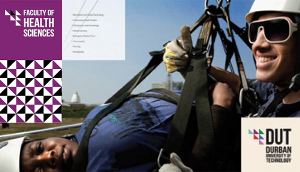
This colourful combination, seen in the logo, representative of our six faculties, is positioned in an upward trajectory, indicative of the tiers of realisation, intrinsic to learning and higher education. The new DUT logo, supported by an attached visual identity, in the form of Faculty logos and pattern, particular to those faculties, is the product of an exhaustive design process.
This new identity represents an uncluttered, conscious movement to recognise those cultures who were often marginalized through visual depictions of our province and our universities. The triangle also plays a vital role in the construction of philosophies, Medicine, Mathematics and Trigonometry, In the Sciences, in Architecture, the Humanities, Design and Engineering.
This aside, a new logo represents a beginning. We understand that what must follow is a calculated repositioning of brand loyalties based on how our clients experience our brand – at the point of delivery - on the phone, in the lecture room and in the news.
