BrandEbook.com is a Digital Museum of Brand Manual, Our collection includes: brand manual, corporate identity guidelines, graphic standards, visual identity guidelines, brand ebook, brand handbook, brand image brochure, and logo style guide.
BrandEbook.com is an open resource collection and publishing site, We collect and organize the content, but we do not own the copyright.
All files, images, audio/video files, trademarks, text translations and other materials on this site belong to their rightful authors and owners. BrandEbook.com in no case does not claim the copyright of these materials.
Welcome to join our Subscription Plan to support us, you can download the PDF brand manual.
If you would like to have a brand manual displayed on our website, or you would like to cancel your brand brochure posting, please click Contact Us to submit information.
Click here to Brand Manual Download Categories.
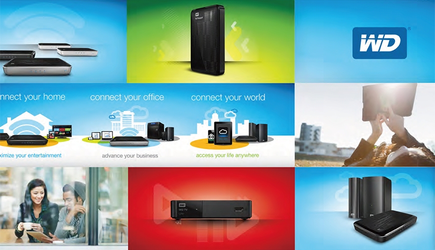
This document is an overview of the visual language of the WD® Brand at retail. It is intended to provide guidance when creating materials locally.
Read more
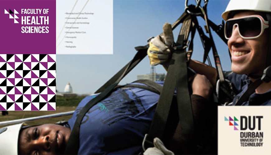
Welcome to the revised corporate identity guidelines for Durban University of Technology. This identity has been developed by staff and students of Workspace - Work Integrated Learning Design Studio in response to a strategic repositioning plan developed in 2011 and approved by Council in March 2012.
This identity is intended to provide a new platform on which we as TEAM DUT can collectively reposition how we present ourselves to our respective target markets.
This logo and visual identity has been designed to work in tandem with a modular design system, based on the square, with the idea of presenting a unified and single-minded visual voice across a wide range of uses and formats whilst retaining impact.
It is safe to add that no identity is ever complete and that we understand that brand building is an ongoing exercise, in which an identity is constantly being refined.
Read more
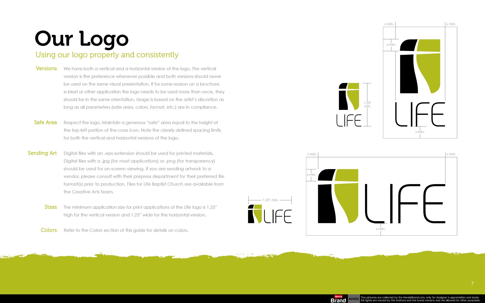
Life is unique as a church because we provide Christ-life discipleship in a relational setting to people from Gen X and Y who desire to live their faith—not just talk about it. Visually and in all creative efforts we want to establish a clean and uncluttered environment. The Life brand should represent freedom, clarity and organization with organic elements of expression such as an occasional brush stroke or hand-drawn line. Public-facing materials should never be dark, heavy or overly busy. All materials should be clear, concise and consistent with clean typesetting and plenty of room to breathe.
Read more
The members of the University of Delaware community, including our outside partners, are stewards and storytellers of this great University. Our task is to articulate and herald its unique identity to the world. The University of Delaware Brand Style Guide is designed to help all those working at and with UD to be the best ambassadors of its image, reputation and story throughout the world.
Read more
")


")


")


")


