")


")


BrandEBook.com
BC Hydro & Power Smart Brand Identity Guidelines
BRAND OVERVIEW
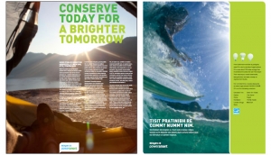
As our primary public face, the BC Hydro For Generations brand is concerned not only with the day-to-day business of meeting the needs of our customers, but also with communicating a highlevel and enduring vision for energy education, the environment, and our collective energy future.
While the Power Smart brand shares a great deal with its parent brand, its purpose is specific to providing helpful, pragmatic, and simple ways for meeting individual and collective energy conservation goals.
Alberta Government Corporate Identity Manual 2014

Alberta’s corporate identity is a program that identifies the Government of Alberta’s facilities, programs and services. The program includes the Alberta Signature and the emblems of Alberta, including the province’s coat of arms and the flag.
GKN plc Brand Identity Standards

With roots dating back to 1759, today GKN is a global brand that has embraced change and evolved into a world leader, with a proud heritage and an exciting future.
Oxford Blue Visual Identity Guidelines

The University of Oxford is one of the world’s leading academic institutions and one of the oldest, with a unique heritage that dates back to the 11th century. Today its reputation, like its longevity, reflects a deep and abiding commitment to excellence in every area of teaching and research. As a result of that commitment, the University enriches international, national and regional communities in countless ways: through the fruits of its research and the skills of its alumni, through sharing academic and cultural resources, and by publishing outstanding materials in many formats for learning and study.
Master Electric Brand Standards
At Master Electric Company, Inc. we continue to establish our identity to reflect the essence of our brand and our company. Every day we strive to grow and further cement our brand in the minds of our current clients and our future clients.
Kent State University Guide to Visual Standards 2014

Each time someone at Kent State University communicates with the public, it affects our reputation – publications, websites, letterhead, business cards, newsletters and even Facebook posts all contribute to building a great Kent State brand.
An institution’s visual identity externally reflects not only its style and character, but also its traditions, strengths and values. Internally, the visual identity conveys a sense of pride and commitment to a common mission. A comprehensive visual identity program projects a message of cohesiveness, leveraging the strength of the university across all audiences.
Jefferson Brand Guidelines
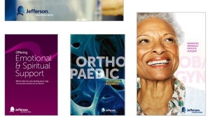
ONE JEFFERSON
Anglican Church Southern Queensland Brand Guidelines and Style Guide

The Anglican Church Southern Queensland is an integral part of society, working to care for and improve the life of the community through our network of Parishes, Schools, Community Services, Ministry Education, and Social Justice and Advocacy.
Across all of the services a range of names and logos are used with differing degrees of relevance to the organisation, the Anglican Church Southern Queensland.
Vegan Society Brand Guidelines

Who we are
The Vegan Society
We are an educational charity, established in 1944 that promotes and supports the vegan lifestyle. We still hold true to the vision of our founding members today – a world in which humans do not exploit other animals. We’re
as determined as ever to encourage vegan lifestyles for the benefit of people, other animals, and the environment.
Budoni Welcome Manuale di Corporate Identity Territoriale

La brand identity di una destinazione turistica è l’insieme di tutte le caratteristiche, i valori e i tratti distintivi del territorio:
quegli elementi di unicità che costituiscono lo spirito del luogo, o genius loci. La marca di un territorio, a differenza di un prodotto industriale, deve necessariamente distillare un’ampia gamma di attributi tangibili ed intangibili della destinazione, tenendo conto della pluralità, ma arrivando ad una sintesi efficace.
La traduzione grafica e formale di questa sintesi è la corporate identity della destinazione, l’immagine coordinata che traduce visivamente e tangibilmente gli elementi di unicità rendendoli percepibili da ospiti e turisti.
La definizione della corporate identity territoriale è pertanto un passaggio preliminare e cruciale, che assume un’importanza centrale nell’intero processo di sviluppo del prodotto turistico e di comunicazione verso il mercato. L’immagine coordinata sarà utilizzata su ogni supporto, in ogni canale e per ogni messaggio verso l’esterno. La cabina di regia e gli stakeholder della destinazione dispongono, in questo modo, di un minimo comune denominatore grafico e tangibile per uniformare la propria comunicazione e restituire al mondo l’immagine di un territorio coeso e di un sistema che si riconosce attorno ad alcuni valori comuni.
")


")


