")


")


BrandEBook.com Team
Oregon Health and Science University blogs visual identity guidelines
PURPOSE
This document presents the official visual guidelines for all weblogs (blogs) that fall within the Oregon Health & Science University (OHSU) domain, available both internally (O-Zone) and externally to the public. These guidelines are intended to serve as a resource for members of the OHSU community who currently maintain a blog.
Edinburgh Napier University brand essentials
Edinburgh Napier University has come a long way from what many remember as the old polytechnic; growing into a vibrant and contemporary university. We have a great deal to offer our students, business clients, partners and other stakeholders, but not everyone has got that message yet. In an increasingly competitive higher education market, building a strong and distinctive brand identity is central to pursuing our corporate strategy and achieving our commercial goals.
CMU identity standards
CMU ranks among the Midwest’s leading private universities dedicated to fully preparing students through academic excellence, personal attention, critical thinking, knowledge access, career development and servant leadership. A CMU student does not settle for mediocrity, but “aspires” to academic excellence and social consciousness so that he or she is fully equipped to lead and serve in the local and global community.
Safmarine brand manual
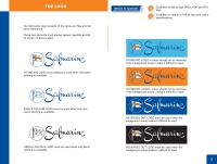
A company’s visual corporate identity is most effective when it is applied consistently.
The purpose of this manual is to show you how to use all the parts of the new corporate identity correctly and to maximum effect.
Veolia World Solar Challenge branding guidelines
The Veolia World Solar Challenge Masterbrand is based upon a set of graphic elements: the sun symbol, the logo type, the corporate typeface and the corporate colours. The standards outlined in these guidelines apply to all advertising, print signage and promotional items.
Pitchero brand guidlines
Pitchero is a global sports network providing free custom websites for amateur and semi professional sports organisations
Let's move together brand guidelines
The Let’s Move Together campaign aims to engage individuals and communities in a conversation about arthritis and activate them to participate in the Arthritis Walk. The following brand guidelines outline the graphic standards for Let’s Move Together, as well as the essence of the campaign and how to best communicate it to key stakeholders.
IMI The Institute of The Motor Industry corporate brand guidelines
Most of us can identify hundreds of brands simply by their colour, graphic style or font. We only identify with a brand when it chimes with our own values, aspirations or beliefs..
Max Hypermarkets brand guidelines for store signing
Background to this document
This document is the culmination of the development of our ‘hypermarket’ store format concept and represents a significant number of changes from the original project - hence this bespoke publication.We urge you read it thoroughly as many of the changes will have significant impacts on the presenting the store look and feel in these contexts.
The important changes to note are divided into two areas - the development of a new identity and the adaptation of the concept to alternate building forms..
Life Baptist Church brand standards
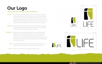
Life is unique as a church because we provide Christ-life discipleship in a relational setting to people from Gen X and Y who desire to live their faith—not just talk about it. Visually and in all creative efforts we want to establish a clean and uncluttered environment. The Life brand should represent freedom, clarity and organization with organic elements of expression such as an occasional brush stroke or hand-drawn line. Public-facing materials should never be dark, heavy or overly busy. All materials should be clear, concise and consistent with clean typesetting and plenty of room to breathe.
")


")


