BrandEbook.com

BrandEBook.com

BrandEBook.com

星期四, 24 5月 2012 20:00

Olympus Global Branding Style Guide

This manual is based on the editing policy of the Visual Identity Manual published in 1996. The 1996 Visual Identity Manual is a simplified and condensed version of the original Corporate Identity Manual published in 1980 and revised in 1990. Only the rules on outward aspects were included.

MTN Foundation is a division of the MTN Masterbrand. These guidelines address the visual representation of MTN Foundation Brand Positioning through the interpretation of typography, colour, imagery and illustrations. When we do not adhere to these guidelines it undermines the brand strategy and creates confusion around what the brand stands for.

星期二, 22 5月 2012 20:00

Shuswap Brand Book

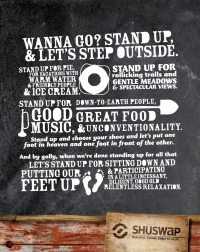
A brand is a story. A story is a brand. It’s who you are and what you do and what you’ve done. It’s also what people say behind your back. This is a brand book, and so it is also a storybook. Its purpose is to assist in telling the Shuswap’s story and to ensure brand consistency.

Our visual identity is more than just the ACM logo. It’s a system of distinctive visual elements with which to create compelling ACM-branded communications.

A strong brand identity system will help ACM become more tangible and relevant to our key audiences by: 

星期日, 20 5月 2012 20:00

Flinders University Brand Style Guide

Every time Flinders University comes in contact with someone from the wider community, we are presented with an opportunity to enhance our reputation.
 
The extent to which audiences across the educational, research, nternational, government, business and community spheres value and respond to the Flinders brand is dependent upon how clearly they understand and interpret our brand position and key messages.
星期四, 17 5月 2012 20:00

TNT Fitness Trainers Brand Manual

At TNT Fitness Trainers, we provide individuals the opportunity to not only meet their goals, but to exceed their fitness expectations. We do not specialize. We generalize. Sports, combat, survival and life reward are just a few of the accomplished goals of our program. It’s very hard exercise that works!
This manual presents the basic elements in the European Year for Active Ageing and Solidarity between Generations 2012 logo to all those who will use it.
The logo must always be reproduced from the master artwork. It must never be altered in any way.
 
Symbol
Two persons, where one is smaller (younger) than the other, connected to each other stands for Solidarity between generations.
The arrow represents a future looking outlook for Active Ageing.
The choosen colours raspberry and plum are choosen to convey warmth and energy.
What Is Branding?
Branding in plain terms is about fostering recognition of and respect for an organization. Once a brand has been firmly established in people’s minds, seeing it instantly evokes certain feelings, beliefs and knowledge. A solid brand also reinforces an organization’s key messages for internal and external audiences.
By having a strong brand, Alberta Health Services is better able to build public awareness, confidence, good will, trust and support. Our brand also instills pride among staff members and external stakeholders, and it improves our ability to recruit and retain talented employees and physicians. Our brand is also vital to attracting and maintaining a solid funding base.
星期一, 14 5月 2012 20:00

TE Connectivity Visual Identity Guidelines

No other company in the world connects and protects the flow of power and data in more products than TE Connectivity.As our company has evolved over more than 50 years, so has our business strategy and focus. We are changing our name to TE Connectivity to better reflect who we are and what we do.In a world that is now increasingly connected, we provide connectivity solutions across almost every industry around the globe.
 
Our new brand will become one of our most valuable assets.It must be communicated and applied consistently and accurately to maintain its strength and integrity. This overview document provides the resources to accurately portray the brand and communicate the attributes and qualities of our company.
星期日, 13 5月 2012 20:00

Neea Brand and Identity Guidelines

The purpose of this book is to make it easier for you to speak about NEEA, write about NEEA, and to design compelling communications that express NEEA’s unique value.

To be successful, NEEA must have open and clear communication with its stakeholders — whether that be contractors, subcontractors, utility owners, government or public interest groups. We’d like everyone to understand NEEA’s mission, as well as our organization’s unique value and benefits. No matter who you are, whether you’re a NEEA staff, a Board member, or a “contractor,” you are, simply put, NEEA’s champions.

Back to top