")


")


BrandEBook.com
星期日, 08 4月 2012 20:00
Delhi State University of New York Graphic Standards
The SUNY Delhi Graphic Standards Manual was created to provide all SUNY Delhi employees and associates with an easy-to-follow set of guidelines that encourage effortless support of the college’s visual identity.
星期三, 11 4月 2012 20:00
Islington Brand Handbook
A bold and distinctive visual identity has been developed for Islington Council that will play a key part in promoting the council as a forward thinking organisation, focused on delivering quality services to our residents and partners.
This set of identity guidelines has been produced to aid the design of all communications material that the council produces. This will ensure that Islington Council portrays a common and easily recognisable visual style that translates across the wide breadth of public services that it provides.
星期二, 10 4月 2012 20:00
Loyola University Chicago Brand and Graphic Standards
A consistent brand promise that is understood and internalized within an organization is also better understood by external audiences. It becomes a rallying cry and a focal point to inform and inspire everyone connected to the brand. Integration and consistency maximize every opportunity to share our values, mission, and promise. Loyola University Chicago Brand and Graphic Standards provides a guide to everyone responsible for creating communications and marketing materials for the University. The goal of this document is to ensure that the University is represented consistently and optimally through all communications that we have with our many audiences, internal and external. It covers everything from use of logos and other images to tone and voice of our messages. We hope you find it helpful.
星期一, 09 4月 2012 20:00
Canam Group Graphic Standards Guide
In 2003-2004, Canam Group and its business units each adopted a new corporate image in order to meet visual identity needs that emerged following changes in the company’s organizational structure.
The present guide is therefore a "bible" of sorts in terms of graphic standards applicable at Canam Group companies. It describes the mandatory rules that apply to the creation and presentation of company logos on all types of mediums (print, electronic, etc.) while also defining any applicable restrictions. The guide fosters the correct and uniform use of all logos with a view to reinforcing their impact.
星期四, 05 4月 2012 20:00
Edith Cowan University Corporate Style Guide
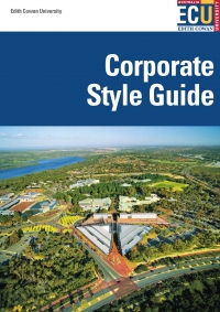
The visual identity of Edith Cowan University (ECU) is an integral part of it’s image. The image of the University is expressed not only in the name, logo and colours of its stationery and signage, but also in all printed material concerning each of the campuses, in the buildings - their location, furnishings and maintenance, the rites of passage within faculties and departments, and the communications between students and graduates both on and off campus.
星期三, 04 4月 2012 20:00
Community Futures Common Brand Program
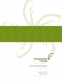
The Community Futures logo is a combination of the leaf symbol and the logo type. The precise and unchanging visual relationship between the symbol and logotype forms the basis of the Community Futures common brand. It can not be altered in any way. The symbol can be used alone in predetermined applications (such as forms and documents templates) and in certain specialized marketing applications.
星期日, 15 4月 2012 20:00
PGA Professional Logo Style Guide and Usage Rules
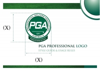
To enhance the recognition of it’s Members, the PGA of Australia has designed a specific PGA Professional logo to more closely identify members with their association in a manageable way. This booklet has been developed to demonstrate to all PGA Members how and where they may use the PGA Professional logo.
星期二, 03 4月 2012 20:00
Boston University School of LAW Graphic Standards Manual
Why a Graphic Standards Manual?
And why now? Our corporate colleagues have taught us the benefits of solid branding and marketing. By distinguishing themselves in a competitive marketplace, companies with similar products, such as IBM and Apple, hold distinct identities and gain customer loyalty. Law schools also exist in a competitive market where educational offerings are hard to tell apart. By establishing a unique identity, we can capture the same loyalties.
星期一, 02 4月 2012 20:00
Einheitliches Erscheinungsbild Der Bergwacht Bayern Brand Guide
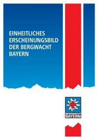
Die Identität der Bergwacht Bayern im Bayerischen Roten Kreuz wird durch diese Farbgebung hervorgehoben.
Das Logo setzt sich aus den Elementen Edelweiß, Rotes Kreuz und Schriftzug auf rechteckigem Grund zusammen. Das Markenzeichen der Bergwacht, das Rote Kreuz auf dem Edelweiß, kommt auf dem bayerisch blauen Hintergrund stark zur
Geltung.
星期日, 01 4月 2012 20:00
Black Country Partner Guidelines
The Black Country brand has been created to give everyone within the sub-region a shared sense of pride and identity, and to encourage businesses, investors, tourists, residents and other audiences to see the Black Country in a new light – as a unified area working towards a common goal and offering exciting opportunities. As such, the Black Country brand belongs to everyone involved in securing the future success and prosperity of the sub-region.
")


")


