")


")


BrandEBook.com
Life Baptist Church brand standards
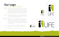
Life is unique as a church because we provide Christ-life discipleship in a relational setting to people from Gen X and Y who desire to live their faith—not just talk about it. Visually and in all creative efforts we want to establish a clean and uncluttered environment. The Life brand should represent freedom, clarity and organization with organic elements of expression such as an occasional brush stroke or hand-drawn line. Public-facing materials should never be dark, heavy or overly busy. All materials should be clear, concise and consistent with clean typesetting and plenty of room to breathe.
Calvary Baptist Church brand guidelines
The Calvary Baptist brand is a visual expression and reflection of the church it represents. It is the identity, perception and expectation of the church in the minds of people in the community. To be effective, it must be distinctive, memorable and consistent. The brand is more than just the logo, and includes colors and fonts as well as design and photography style. The Calvary brand is created through every form of communication from business cards and internal publications, to direct mail, signage, the web, and in many other ways as well.
Williams and Goodwin Property People brand marketing book
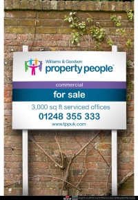
The property market is more competitive than ever, that’s why it’s important to have a distinctive, simple and consistent brand identity. This new Property People logo is the graphic representation of our company and the values it stands for. It identifies us to the world, displaying an image that is both strong and approachable.
NAHB National Association of Home Builders logo guidelines specs
In September 2008, the NAHB Board of Directors adopted a new NAHB Brand Portfolio Strategy. NAHB moved from a system of under-leveraged and dissociated brand offerings to a strongly master-branded system. This move is meant to build strength in the NAHB brand and, through greater linkage to each of our offerings, make those offerings (both individually and as a group) stronger and better able to serve the Members.
Action America brand Guidelines
Often it’s the most trying events that unite the greatest causes, bringing different groups with common goals to the same table.
With a collective voice and a united front, diverse organizations stand to create a movement far larger and more powerful than the sum of their separate parts.
IRISS Institute for Research and Innovation in Social Services brand identity guidelines
The IRISS brand identity is unique. Our visual identity is one of the most important aspects of our brand. It shapes how people see us. It’s crucial that the brand appears correctly and consistently in every communication. These simple rules and guidelines need to be followed when using elements from the IRISS branding to ensure that we communicate consistently and speak the same visual language.
The Valleys Heart and Soul of Wales design guidelines
This guide has been created to ensure consistency and legibility when using ‘The Valleys’ visual identity system.
It is crucial that we use these basics consistently as even small variations may undermine the impact and integrity of the new Valleys brand. These guidelines have been produced to provide direction when working with our new visual identity system.
USAID US Agency for International Development interim graphic standards
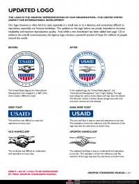
USAID's framework legislation, the Foreign Assistance Act of 1961, as amended, section 641, requires that all programs under the Foreign Assistance Act be identified appropriately overseas as "American Aid."
Further, since 9/11, America's foreign assistance programs have been more fully integrated into the United States' National Security Strategy. This elevation to the so-called "third-D" (development being added to diplomacy and defense) increased the need for U.S. foreign assistance activities to be more fully identified in the host country as being provided "from the American People." We have been identified as "America's good-news story" and have been tasked to make our efforts more visible and better known in the countries where we work.
Affiliated Distributors logo and style guidelines
We have updated our logo to better reflect our group’s leadership position and aspirational qualities as a marketing group. We call our new mark “The Mountain.” The new logo mark shows a series of peaks growing from the classic A-D triangle. The surrounding sphere represents our inclusive community. This image portrays strength, leadership, collaboration and growth.
Temptation Resort Spa Cancun corporate identity manual
A successful brand does not only speak about the product it sells, but also portrays the company, including the people that work for it and the values that guide their decisions and actions.
")


")


