")


")


BrandEBook.com Team
ExCeL London brand guidelines

Etihad Airways Brand Guidelines

Berkeley University of California Brand Training workbook

The Berkeley brand platform was created and introduced to campus in early 2013 by the Office of Communications & Public Affairs. One of the salient features of the brand platform and toolkit was the flexibility it provided colleges and departments who could use it to create messaging that was unique and yet united.
eco CI Corporate Identity Guide Brand Manual
e.co is the first independent communications infrastructure services company in Southeast Asia, providing end-to-end infrastructure solutions to telecom and non-telecom operators, with a portfolio that includes towers, energy, transmission and operations/maintenance. We aim to provide the best service possible in an environmentally friendly manner, while pushing the boundaries of technology.
BBSI Identity and Marketing Guidelines Standards

TCDC Corporate Identity Basic Guidline
Khanom is a name given to countless sweet or savory Thai “dumplings”, imaginatively “invented” and made for generations by hand, from locally found ingredients. Khanom comes in hundreds of shapes, styles and flavors and is made from a myriad of ingredients. It is a strong and simple icon relating our Thai value creation to the natural use of raw materials.
Toshiba Brand Guidelines 2012
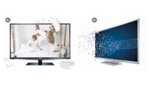
Toshiba is all about making extraordinary technology available to everyone. Our brand is brimming with the passion to help technology enrich people’s lives. Toshiba’s tone of voice comes from a fundamental point of view. We always see things from the user’s perspective. And how they want technology to better their lives.
Take for example the new tablet. Yes, it’s the world’s thinnest. But that message comes straight from our internal obsession and passion for the best technical engineering. For the user it means he or she can take their tablet easily to more places – to bed, to the garden or pack it for a holiday. It becomes the most handy way ever to access fun, do the shopping, enjoy films and more.
Aitac Graphic Standards
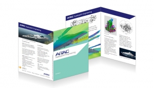
AITAC has been founded in 2002, and from the start its main activities have been:
Yacht design, Marine and Offshore Engineering
CATIA and Dassault Systèmes solutions expertise
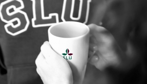
SLU Brand Manual
You are an ambassador for a united SLU
You are holding SLU's Brand Manual. Here you will find guidelines on how we use common tools to create a clear profile. We must be consistent in our use of logotype, colour, image and language, so that the university is perceived as a clear and credible communicator. This will also improve the chances of recognition.
SLU's brand should signal that we are a world-class university in the fields of life and environmental sciences. You are an important ambassador for SLU's brand. Together we will demonstrate that we are one university – a united SLU.
MCPHD Marion County Public Health Department Brand Identity Standards Guide

A brand and the subsequent experience encountered from the brand reflects the promise and personality of any successful organization. It’s what people think of whenever they experience the name MCPHD. The brand, or identity experience, is directly connected to MCPHD continuing to offer the finest in public health community services to every Marion County resident. One part of the identity experience is portrayed through the organization’s visual identity or logo. When used consistently in communication materials, the brand will ensure that relevant core messages reach the various MCPHD publics.
")


")


