BrandEbook.com è un museo digitale del manuale del marchio, la nostra collezione comprende: manuale del marchio, linee guida per l'identità aziendale, standard grafici, linee guida per l'identità visiva, ebook del marchio, manuale del marchio, brochure sull'immagine del marchio e guida allo stile del logo.
BrandEbook.com è una raccolta di risorse aperte e un sito di pubblicazione, raccogliamo e organizziamo il contenuto, ma non possediamo il copyright.
Tutti i file, le immagini, i file audio/video, i marchi, le traduzioni dei testi e gli altri materiali presenti in questo sito appartengono ai legittimi autori e proprietari. BrandEbook.com in nessun caso non rivendica il copyright di questi materiali.
Benvenuto per unirti al nostro piano di abbonamento per supportarci, puoi scaricare il manuale del marchio PDF.
Se desideri che un manuale del marchio venga visualizzato sul nostro sito Web o desideri annullare la pubblicazione della brochure del tuo marchio, fai clic su Contattaci per inviare informazioni.
Clicca qui per andare a scaricare le Categorie.
The IRISS brand identity is unique. Our visual identity is one of the most important aspects of our brand. It shapes how people see us. It’s crucial that the brand appears correctly and consistently in every communication. These simple rules and guidelines need to be followed when using elements from the IRISS branding to ensure that we communicate consistently and speak the same visual language.
Read more
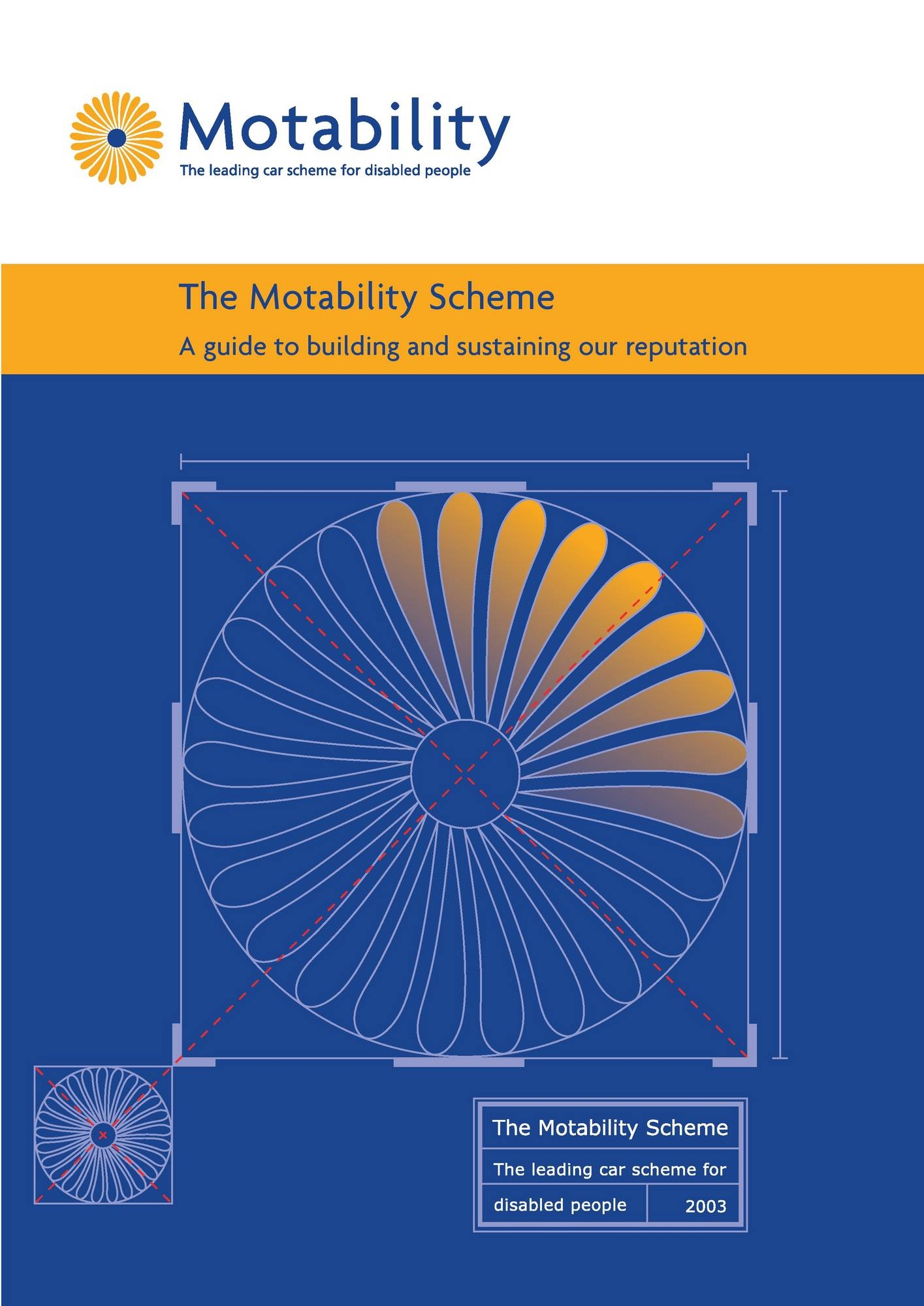
The Motability Scheme began in 1978 and since then it has changed the lives of almost 700,000 disabled people and their families in the UK.
By the mid 1970s almost every household in the country owned a car. But disabled people were missing out. As a result, many people were housebound for long periods and often dependent on others for their mobility.
Before the introduction of the Mobility Allowance in 1976, only disabled people who could drive themselves got any government help with personal transport. It was usually in the form of a small car provided to disabled couples, to people responsible for the sole care of a disabled child and to a category called “war disabled”. An allowance was paid to disabled people who actually owned a car. But most people were supplied with a small, blue, single-seat, three wheeled, motorised “invalid trike”, which was incapable of carrying passengers.
Read more
As one of the longest-running youth volunteer initiatives in America, Trick-or-Treat for UNICEF has a deep-rooted history of child empowerment. On Halloween night in 1950, the original “kids helping kids” program launched, as girls and boys across the nation collected coins to aid children still affected by World War II. This humble effort was the beginning of a yearly tradition dedicated to ending the unnecessary suffering of the world’s most vulnerable children.
Today, the mission still resonates, with the Trick-or-Treat for UNICEF brand as fresh and relevant as ever. The brand remains engaging for children with the addition of our new character choices, while still evoking a sense of nostalgia in parents and teachers (our secondary audience).
Read more
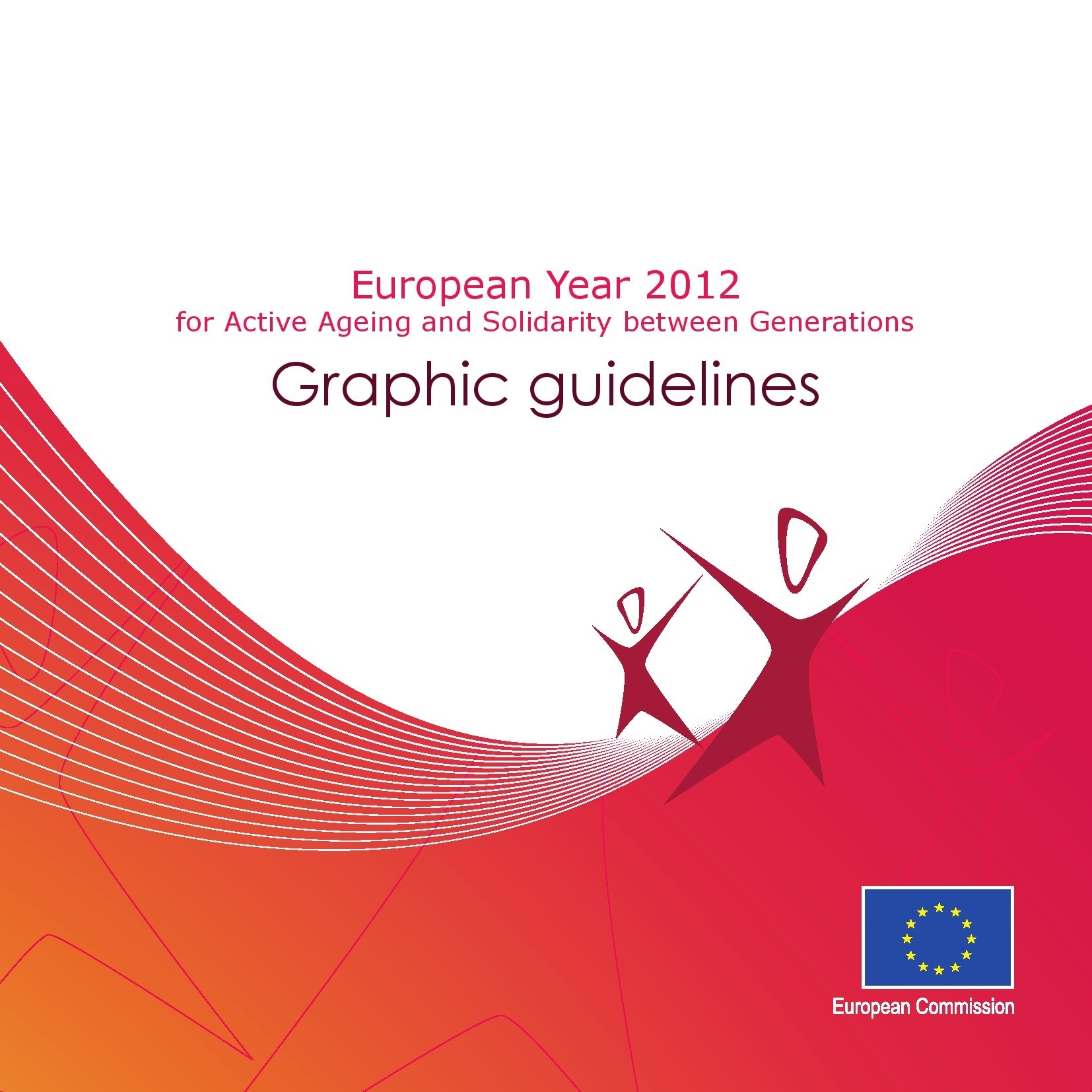
This manual presents the basic elements in the European Year for Active Ageing and Solidarity between Generations 2012 logo to all those who will use it.
The logo must always be reproduced from the master artwork. It must never be altered in any way.
Symbol
Two persons, where one is smaller (younger) than the other, connected to each other stands for Solidarity between generations.
The arrow represents a future looking outlook for Active Ageing.
The choosen colours raspberry and plum are choosen to convey warmth and energy.
Read more
")


")


")


")


