BrandEbook.com is a Digital Museum of Brand Manual, Our collection includes: brand manual, corporate identity guidelines, graphic standards, visual identity guidelines, brand ebook, brand handbook, brand image brochure, and logo style guide.
BrandEbook.com is an open resource collection and publishing site, We collect and organize the content, but we do not own the copyright.
All files, images, audio/video files, trademarks, text translations and other materials on this site belong to their rightful authors and owners. BrandEbook.com in no case does not claim the copyright of these materials.
Welcome to join our Subscription Plan to support us, you can download the PDF brand manual.
If you would like to have a brand manual displayed on our website, or you would like to cancel your brand brochure posting, please click Contact Us to submit information.
Click here to Brand Manual Download Categories.
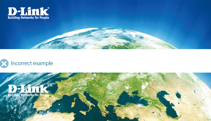
The D-Link brand positioning
In a world where nothing stands still, D-Link inhabits an environment of intensive competition and higher consumer expectation.
Innovation, Quality and Reliability are the three key points of differentiation that constitute the essence of D-Link and reaffirm our position in the marketplace.
Our brand character is expressed in our tone of voice and visual identity. To our consumer audience we are supportive, imaginative, vibrant and dynamic. To our business customers, we are honest and pragmatic; firmly rooted in common sense we instil professionalism and credibility. In corporate communications, D-Link speaks with a confident, professional and polite tone of voice, underpinned by intelligence and enthusiasm.
Read more
DHL has redefined and redesigned its brand identity – as can be seen in new print publications, advertising material, corporate wear, etc. Clear guidelines for the visual appearance of the brand in all analogue and digital channels are essential for an integrated DHL brand experience – towards the customer as well as internally. The redefined guidelines for the analogue world are now transferred to the DHL online experience and appearance.
Read more
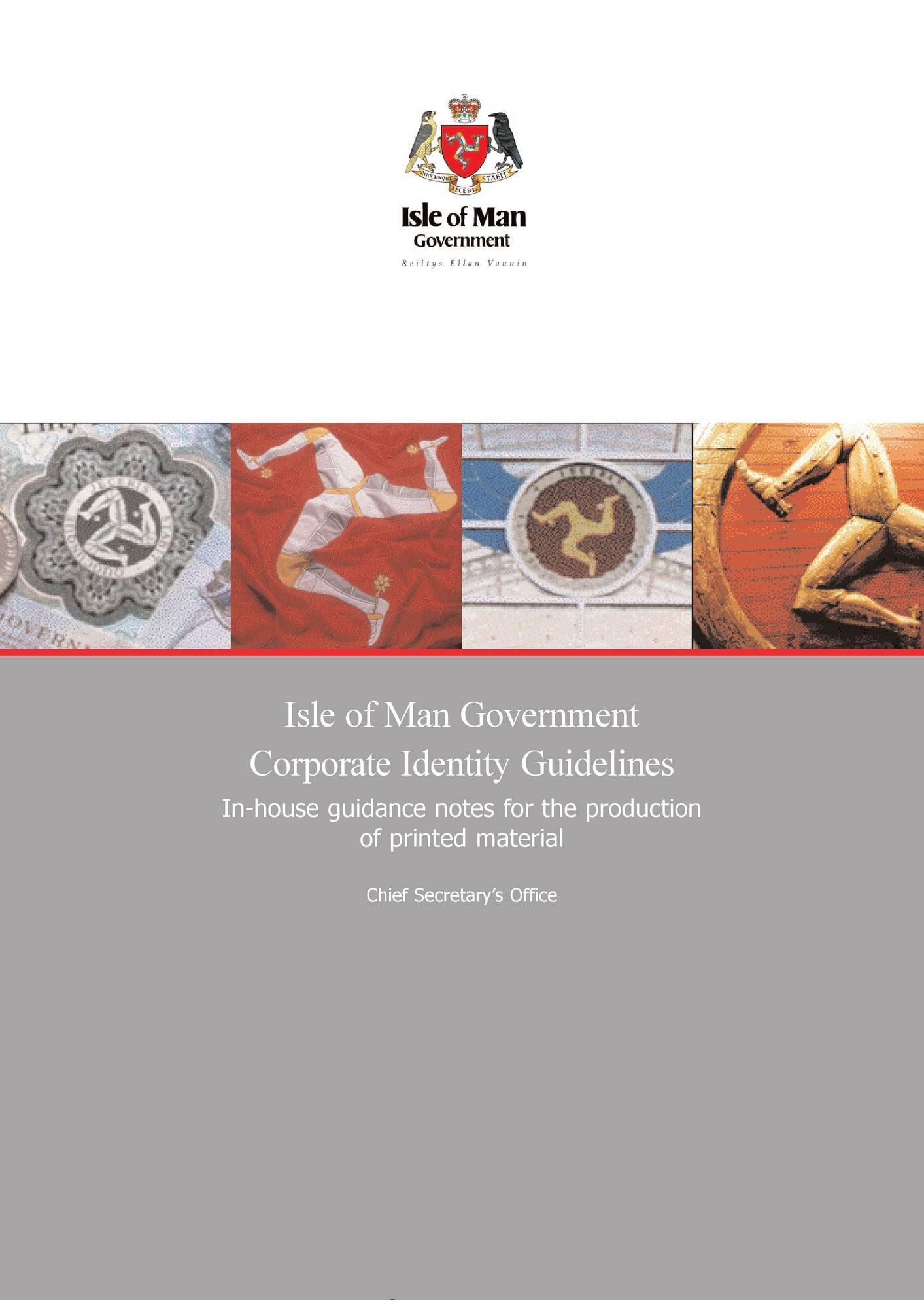
Having a visual symbol of our corporate identity serves three purposes. It brings cohesion to the diverse range of material we produce, it identifies us as the originators of the material and it helps keep costs down by saving time in the preparation of specifications.
This guide provides simple, brief advice on how to use our visual identity. I would be grateful if you could read it and refer to it whenever you commission or prepare material, including stationery and electronic publishing.
Read more
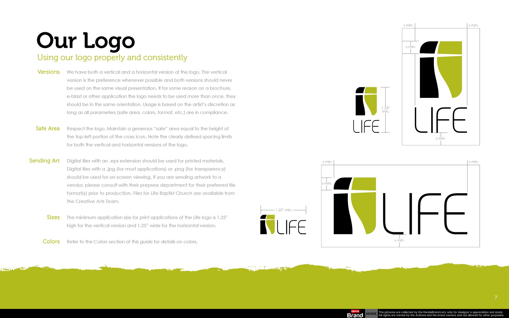
Life is unique as a church because we provide Christ-life discipleship in a relational setting to people from Gen X and Y who desire to live their faith—not just talk about it. Visually and in all creative efforts we want to establish a clean and uncluttered environment. The Life brand should represent freedom, clarity and organization with organic elements of expression such as an occasional brush stroke or hand-drawn line. Public-facing materials should never be dark, heavy or overly busy. All materials should be clear, concise and consistent with clean typesetting and plenty of room to breathe.
Read more
")


")


")


")


