BrandEbook.comは、ブランドマニュアルのデジタル博物館です。当社のコレクションには、ブランドマニュアル、コーポレートアイデンティティガイドライン、グラフィック標準、ビジュアルアイデンティティガイドライン、ブランドebook、ブランドハンドブック、ブランドイメージパンフレット、ロゴスタイルガイドが含まれます。
BrandEbook.comは、オープンなリソースの収集および公開サイトです。コンテンツを収集および整理しますが、著作権は所有していません。
このサイトのすべてのファイル、画像、オーディオ/ビデオファイル、商標、テキスト翻訳、およびその他の資料は、正当な作成者および所有者に帰属します。 BrandEbook.comは、これらの資料の著作権を主張するものではありません。
私たちをサポートするために私たちのサブスクリプションプランに参加することを歓迎します、あなたはPDFブランドマニュアルをダウンロードすることができます。
当社のウェブサイトにブランドマニュアルを表示したい場合、またはブランドパンフレットの投稿をキャンセルしたい場合は、[お問い合わせ]をクリックして情報を送信してください。
カテゴリーをダウンロードするために移動するには、ここをクリックして。
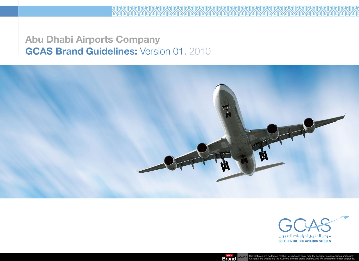
About Abu Dhabi Airports Company
Abu Dhabi Airports Company (ADAC) was created on the 4th March 2006 to spearhead the redevelopment of the Emirate’s aviation infrastructure. To this end, it plays a key part in the Government of Abu Dhabi’s Plan 2030. Wholly owned by the Abu Dhabi Government, the company is headquartered at its principal asset, Abu Dhabi International Airport.
Read more
Like the Paralympic Movement itself, the Paralympic brand has evolved dynamically over the years. Adopted in 2003, the Paralympic Symbol – the three Agitos, from Latin meaning “I move” – symbolises constant motion, always moving forward and never giving up. And its circular character embodies the bringing together of athletes from all corners of the world.
Ultimately, we strive for the Paralympic Symbol to be universally recognised throughout the world as representing sporting excellence and the Paralympic values of courage, determination, inspiration and equality. I believe the IPC Brand Book is a milestone that will drive us forward in a fresh and exciting direction.
Read more
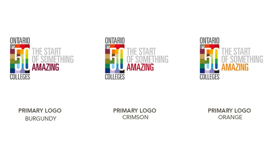
In today’s highly competitive and overly marketed world, even colleges and universities are constantly competing for attention. Because of this barrage of messaging in the marketplace and the complexity of our institution, it is critical to our success that we speak with one united voice.
Read more
Facebook’s mission is to make the world more open and connected. People use Facebook to stay connected with friends and family, to discover what’s going on in the world, and to share and express what matters to them.
At Facebook, we build tools that help people to connect with one another and tools that make sharing what they want to share—ideas, stories, and photos—much easier.
By doing this, we are extending people’s capacity to build and maintain relationships.
Welcome.
Use these assets and identity guidelines to accurately communicate the Facebook brand.
Read more
")


")


")


")


