BrandEbook.com est un manuel du musée numérique de la marque. Notre collection comprend : un manuel de la marque, des directives d'identité d'entreprise, des normes graphiques, des directives d'identité visuelle, un ebook de marque, un manuel de marque, une brochure d'image de marque et un guide de style de logo.
BrandEbook.com est un site de collection et de publication de ressources ouvertes. Nous collectons et organisons le contenu, mais nous ne possédons pas les droits d'auteur.
Tous les fichiers, images, fichiers audio/vidéo, marques, traductions de textes et autres éléments de ce site appartiennent à leurs auteurs et propriétaires légitimes. BrandEbook.com ne revendique en aucun cas le droit d'auteur de ces documents.
Bienvenue à rejoindre notre plan d'abonnement pour nous soutenir, vous pouvez télécharger le manuel de la marque PDF.
Si vous souhaitez afficher un manuel de marque sur notre site Web, ou si vous souhaitez annuler la publication de votre brochure de marque, veuillez cliquer sur Nous contacter pour soumettre des informations.
Marque Manuel télécharger Catégories.
Nous avons soigneusement sélectionné à partir d'un lot de manuel de la marque ( directives sur l'identité de marque de l'entreprise ), fournir une description simple et le lien de téléchargement . Cliquez ici pour accéder à la page recommander .
More than 100 years of product innovation, technological advancement and exceeding customer expectations have earned the Meritor brand the ability to communicate the very qualities we want associated with our company and our products.
As a result, our sales and marketing efforts are built on the foundation of powerful brand equity — but only through the correct and proper usage of our identity can we maximize its impact.
Lire la suite
What is a Brand?
A brand is a promise that should be easily understood through a simple idea you can place in the minds of your various stakeholders.
A Brand Promise should help to focus on the delivery of product and service experiences.
A brand helps you all work together towards the same ambition.
Lire la suite
Use of the logo and graphic marks
The UEFA EURO 2012. brand manual can only be used by authorised parties who have been granted the necessary rights by UEFA. This brand manual outlines the graphic principles, the colours, the graphic arrangements, template solutions and the rules of association between the o!cial marks and logos.
Lire la suite
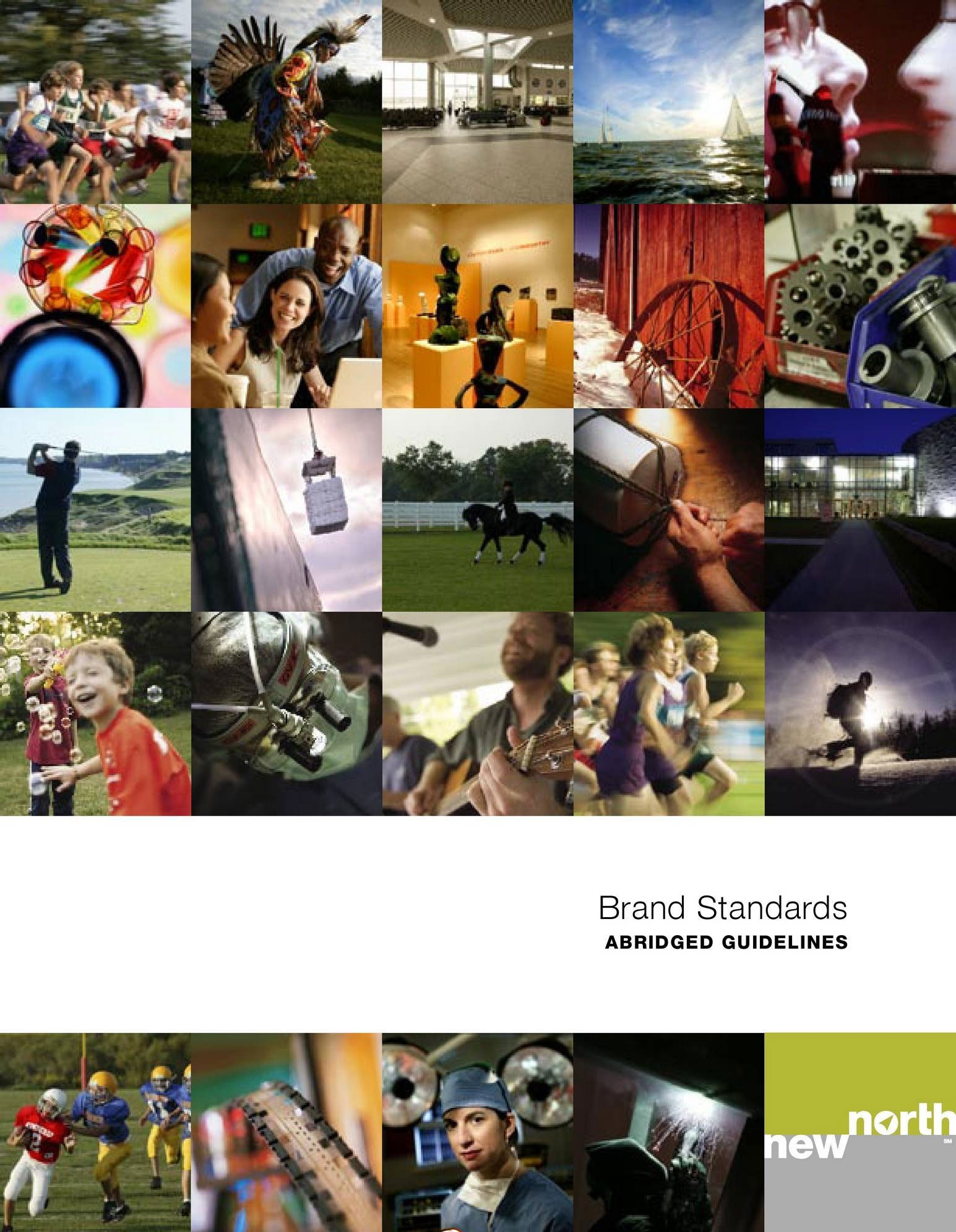
The New North is the 18 county region in Northeast Wisconsin. The New North brand unites the region both internally and externally, signifying the collective economic power behind our 18 counties. The counties include Outagamie, Winnebago, Calumet, Waupaca, Brown, Shawano, Oconto, Marinette, Door, Kewaunee, Sheboygan, Manitowoc, Fond du Lac, Green Lake, Marquette, Florence, Menominee, and Waushara.
Lire la suite
")


")


")


")


