Wmt Walmart Global Tech Identity Styleguide |
| |
|
|
|
| 評価: |
|
| ファイル: |
10 |
| サイズ: |
45.21 Mb |
| |
|
|
| |
|
登録した会員は速やかにコメントすることができますが、上級会員のみこのファイルをダウンロードすることができますので、先に登録とアップグレードをお願いします。
|
|
|
| |
|
| |
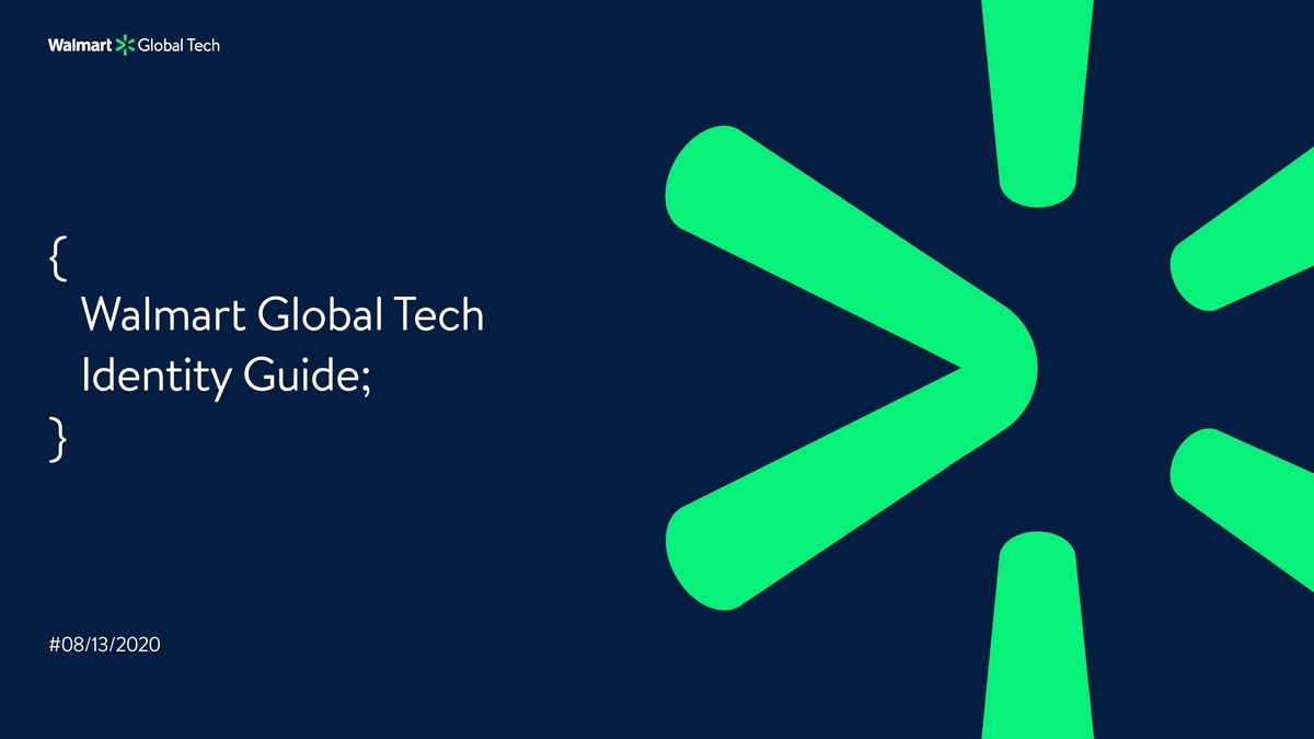
Welcome to the Walmart Global Tech Identity Guide. This document will introduce you to the basic elements of our new identity. Understanding these guidelines will be essential in maintaining a consistent voice for Walmart Global Tech.
Walmart Global Tech’s unique narrative is about putting people first. Its identity, outlined in this document, is a reflection of this core value and Walmart’s future of innovation.
The logo of Walmart Global Tech is the combination of a simple and modern wordmark with the icon, differentiating it from the Walmart brand while staying true to the brand ecosystem. It is inspired by the Walmart Spark and a universally recognizable character that is used in coding: <the bracket>.
Walmart is generally based on blue with yellow as an accent color. Walmart+ is the inverse. We’ve identified a similar exploration for Walmart Global Tech using Global Green as the base color for our concepts. The green signifies “go,” it means “progress,” it evokes nature and earth. In a world where we are looking to create disruption on a global scale, the Global Green represents our enthusiasm and optimism.
|
| |
登録した会員は速やかにコメントすることができますが、上級会員のみこのファイルをダウンロードすることができますので、先に登録とアップグレードをお願いします。
|
| |
|
|
|
")


")


")


")


