")


")

PDF Brand Identity Guidelines Download Recommends
TNT Fitness Trainers Brand Manual
At TNT Fitness Trainers, we provide individuals the opportunity to not only meet their goals, but to exceed their fitness expectations. We do not specialize. We generalize. Sports, combat, survival and life reward are just a few of the accomplished goals of our program. It’s very hard exercise that works!
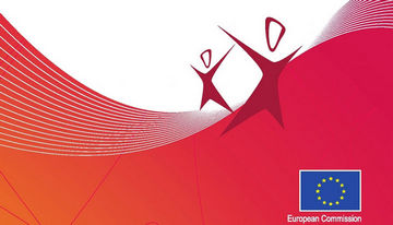
European Year 2012 Graphic Guidelines for Active Ageing and Solidarity between Generations
This manual presents the basic elements in the European Year for Active Ageing and Solidarity between Generations 2012 logo to all those who will use it. The logo must always be reproduced from the master artwork. It must never be altered in any way. Symbol Two persons, where one is smaller (younger) than the other, connected to each other stands for Solidarity between generations. The arrow represents a future looking outlook for Active Ageing. The choosen colours raspberry and plum are choosen to convey warmth and energy.

Alberta Health Services Visual Identity Standards 精选
What Is Branding? Branding in plain terms is about fostering recognition of and respect for an organization. Once a brand has been firmly established in people’s minds, seeing it instantly evokes certain feelings, beliefs and knowledge. A solid brand also reinforces an organization’s key messages for internal and external audiences. By having a strong brand, Alberta Health Services is better able to build public awareness, confidence, good will, trust and support. Our brand also instills pride among staff members and external stakeholders, and it improves our ability to recruit and retain talented employees and physicians. Our brand is also vital to attracting and maintaining a solid funding base.
TE Connectivity Visual Identity Guidelines 精选
No other company in the world connects and protects the flow of power and data in more products than TE Connectivity.As our company has evolved over more than 50 years, so has our business strategy and focus. We are changing our name to TE Connectivity to better reflect who we are and what we do.In a world that is now increasingly connected, we provide connectivity solutions across almost every industry around the globe. Our new brand will become one of our most valuable assets.It must be communicated and applied consistently and accurately to maintain its strength and integrity. This overview document provides the resources to accurately portray the brand and communicate the attributes and qualities of our company.
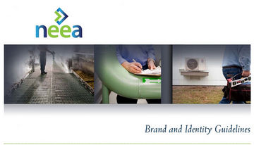
Neea Brand and Identity Guidelines 精选
The purpose of this book is to make it easier for you to speak about NEEA, write about NEEA, and to design compelling communications that express NEEA’s unique value. To be successful, NEEA must have open and clear communication with its stakeholders — whether that be contractors, subcontractors, utility owners, government or public interest groups. We’d like everyone to understand NEEA’s mission, as well as our organization’s unique value and benefits. No matter who you are, whether you’re a NEEA staff, a Board member, or a “contractor,” you are, simply put, NEEA’s champions.
Doncaster College Corporate Identity Guidelines
This document sets out procedures and guidelines for all publicity surrounding Doncaster College and its partners. Using our corporate identity, as advised in this guideline document will ensure that Doncaster College is promoted consistently and professionally at all times. To ensure that all internal and external marketing materials are conforming to the guidelines they will need to be signed off by the Head of Marketing before proceeding. If the guidelines set out in this document are not followed the publicity material will be immediately withdrawn by the Senior Management. In addition, more guidelines on Marketing materials can be found in the Frequently Asked Questions in this document.
C Spire Graphic Standards
The C Spire Graphic Standards Manual is designed to provide you with guidelines to follow for correct usage of the C Spire identity including the mark, logotypes and related graphical elements. These standards have been established to ensure that all of our communications reflect the same high standard of quality, attention to detail and consistency that characterize C Spire. Used correctly and consistently, the C Spire identity is a powerful asset, one that directly supports our vision to be the best service provider in the region. It helps communicate who we are, what we do and how well we do it - all critical elements that shape the positive image of C Spire.
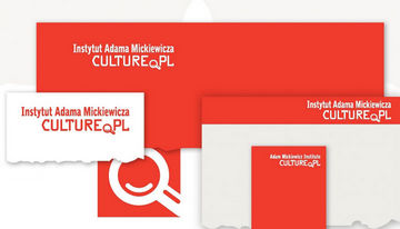
Adam Mickiewicz Institute Brand Book 精选
The Adam Mickiewicz Institute is a national institution of culture responsible for promotion of Polish culture around the world and active participation in international cultural exchange. Projects prepared with foreign partners are presented in the leading galleries, concert halls, cinemas, theatres and public space around the world.
Edith Cowan University 2010 Corporate Style Guide 精选
The visual identity of Edith Cowan University (ECU) is an integral part of its image. The image of the University is expressed not only in the name, logo and colours of its stationery and signage, but also in all printed material concerning each of the campuses, in the buildings - their location, furnishings and maintenance, the rites of passage within faculties and departments, and the communications between students and graduates both on and off campus.
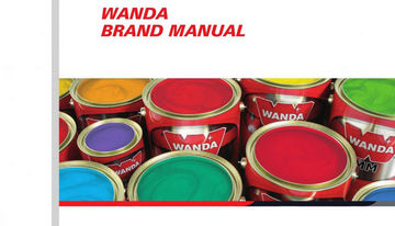
Wanda Brand Manual
With 75 years on the market, Wanda is synonymous with tradition and quality in automotive refinishing. As a global product of AkzoNobel - Car Refinishes, Wanda needs a consistent corporate identity manual. AkzoNobel, along with its distributors and importers, constantly promotes the brand.
")


")


