")


")

Background to this document
This document is the culmination of the development of our ‘hypermarket’ store format concept and represents a significant number of changes from the original project - hence this bespoke publication.We urge you read it thoroughly as many of the changes will have significant impacts on the presenting the store look and feel in these contexts.
The important changes to note are divided into two areas - the development of a new identity and the adaptation of the concept to alternate building forms..
Max Hypermarkets brand guidelines for store signing
Background to our new identity
It has been agreed that Max Hypermarket has to have either a different brand name or if the same name is kept, then it should be very different than the current Max fashion retail brand identity. It is the intention to keep the identity of the Max fashion brand and Hypermarket brand as distinct entities and since each customer experience could be very different in both the formats, it is more appropriate to have a separate identity for the Super/Hypermarket offer.
Since Max as a brand name connotes the “maximum” (which is in sync with the brands’ thought of “delivering the maximum value to the customer”) and the name is easy to spell, understand and very concise, it has been agreed to go ahead with that.
Objective
To create a vibrant, dynamic, strong and striking identity that connotes youth and progression.
Rationale
To introduce your retail format into India, what’s needed most is an identity that projects warmth and welcoming. The colour palette has been freshened-up so as the palette is crisper and cleaner, again supporting the ‘freshness’ message. The bright, straightforward, colours contribute to the positioning of a business devoted to delivering maximum value in an open and straightforward a manner.
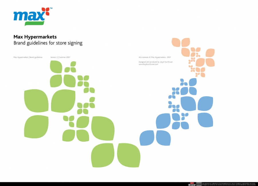
A ‘leaf’ device, as a carrier for the store format name or product line/description, underscores the aim of delivering maximum appeal and the most up-to-date lines – as well as product freshness.
The three ‘petal’ shapes signify the blossoming of this new brand and add significant visual distinction. The relationships of these components add up to a unique symbol for the business, which while contemporary, echo distinctly Indian visual characteristics. A crucial dimension and differentiator as the retail markets develop and competition intensifies.
Background to our new store formats
As we begin to establish our business model we have to be aware - and adapt to - local conditions that may bring constraints to bear on our ideal plans. The process of bringing a retail brand to market means that some format adaptation will be required and this document sets out the impact of such situations. Please study the building types carefully and be aware of the changes we have made accordingly, especially to floor-plates and ceiling heights.
Downloads:
Only registered and logged in users can download this file.

Information
Created
Lunedì, 11 Giugno 2012 06:37
Changed
Giovedì, 30 Dicembre 1999 19:00
Version
Size
3.54 Mb
Rating
Created by
BrandEBook.com
Changed by
Downloads
12
License
Price
")


")


